What Makes a Premium Website Theme Actually Premium?

A premium website theme is more than a collection of attractive layouts. The difference between a template that looks premium and one that actually is premium lives in the details most users never consciously notice — the spacing rhythm, the typographic hierarchy, the consistency of interaction states, the weight of every transition. Felt, not seen.
Premium Design Is More Than Aesthetic
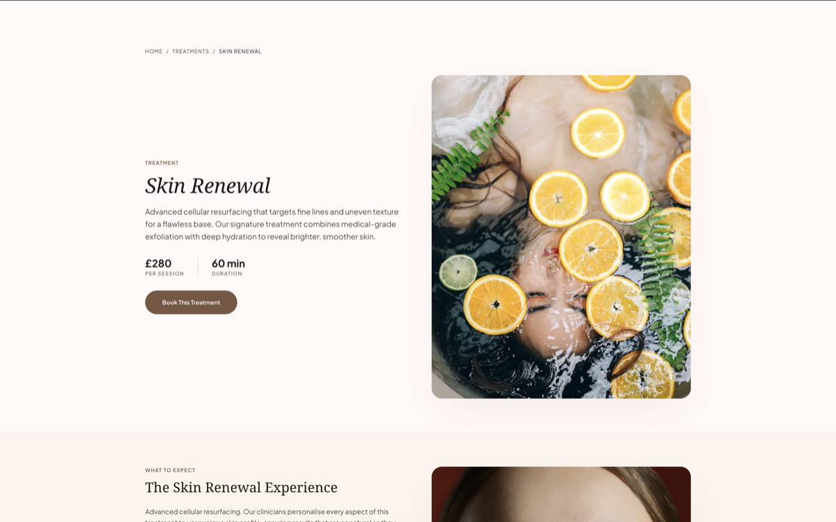
Spacing is the invisible infrastructure of great design. Premium themes use a consistent spacing scale — 4px, 8px, 16px, 24px, 32px, 48px, 64px — applied systematically across every component. The result is visual rhythm: a page that breathes evenly, where the eye knows where to rest and where to move. Generic templates break this rhythm constantly, applying arbitrary padding values that create tension without the viewer knowing why.
Typography is the voice of a brand — and most templates get it wrong. Premium themes begin with a considered typographic scale: a primary display typeface for headlines, a readable body typeface for prose, a monospaced or accent face for labels and metadata. Each size, weight, and line-height is chosen to create clear hierarchy. The heading is unmistakably a heading. The body is comfortable at length. The label is compact and scannable. When the type system is coherent, the entire page becomes easier to read without any conscious effort.
Consistency is the true mark of premium execution. A button in the navigation has the same border-radius as a button in the footer. The hover state on a card mirrors the hover state on a list item. Hover transitions use the same easing curve across every interactive element. This level of consistency signals craft — the presence of intentional decision-making at every level of the component system, not just the hero section.
Why Generic Templates Often Feel Cheap
Overcrowded layouts are the most recognizable symptom of generic template design. When sections compete for attention — every element demanding equal visual weight — the page creates anxiety rather than guiding conversion. Premium design is selective: most of a screen is given to one idea. Negative space isn't emptiness; it's contrast, and contrast creates emphasis.
Inconsistent UX signals that decisions were made piecemeal, not systematically. Tabs that behave differently than accordions. Forms with different validation patterns on different pages. Modals that animate in from different directions. Each inconsistency is individually forgivable — together, they accumulate into a digital experience that feels untrustworthy. Trust, once eroded, is almost impossible to recover within a single session.
Poor mobile optimization is where most generic templates finally fail completely. A layout that looks acceptable on desktop often collapses on mobile into something that bears little relationship to the original design intent. Oversized images that overflow containers. Text that requires horizontal scrolling. CTAs buried below the fold. These aren't minor inconveniences — with more than 60% of traffic arriving on mobile, they are conversion killers.
“Good design feels invisible but intentional — every detail earns its place without announcing itself.”
Mobile Optimization Matters More Than Ever

Responsive grids are necessary but not sufficient. A truly mobile-optimized theme rethinks the layout hierarchy for small screens — not just stacking columns, but reconsidering which elements matter most when screen real estate is constrained. Primary CTAs should be immediately visible. Secondary navigation should be accessible but unobtrusive. Social proof should appear early, not buried below three promotional sections.
Typography scaling on mobile requires its own attention. A 64px display heading that dominates a desktop layout becomes overwhelming at mobile sizes — and scaling it down proportionally often makes it feel timid. Premium mobile typography uses different size relationships: slightly smaller headings, slightly larger body text, increased line-height for comfortable thumb-scroll reading. The reading experience feels natural at any size because the typographic decisions are deliberate at every breakpoint.
Reduced spacing on mobile is about density calibration. The generous padding that creates elegance on desktop creates wasted scroll on a 375px screen. Premium themes tighten vertical spacing on mobile while maintaining enough breathing room to preserve visual hierarchy. Readability at every scroll position is the standard — not just readability at the hero section.
Design Systems Create Better User Experiences
A design system is what separates a theme from a product. When color, typography, spacing, and component behavior are managed through a system — rather than as a collection of one-off decisions — the entire experience becomes consistent in a way that's simply impossible to achieve manually. Every new page inherits the system. Every new component follows the rules. The result is a site that looks as coherent on its hundredth page as it did on its first.
Maintainability improves dramatically when a design system is in place. Changing the primary brand color in a system-driven theme updates every button, every highlight, every interactive element automatically. Changing it in a generic template means hunting through hundreds of individual instances — and missing some. The technical cost of visual consistency compounds in favor of systems over time.
Scalability is the long-term argument for premium, system-driven themes. As a business grows — more pages, more campaigns, more product lines — a design system keeps visual consistency without requiring a complete redesign. The theme that seemed more expensive at purchase consistently proves cheaper over three years when measured against developer hours, brand inconsistencies, and the compounding cost of technical debt in generic alternatives.
Explore Premium Themes
Themes built on real design systems
Every Layero theme is built with a coherent design system — consistent spacing, typographic scale, color tokens, and component behavior from the first page to the last.
BROWSE ALL THEMESarrow_forward