Jewelry Ecommerce Website Inspiration: Design Principles That Sell Premium Pieces
Jewelry ecommerce operates under rules that general retail does not. When a customer is considering a €400 ring or a €900 necklace, the purchase decision is emotional, not transactional — they are buying a feeling, a moment, a signal to themselves or someone else. The ecommerce experience that supports that decision must communicate craftsmanship, authenticity, and aspiration simultaneously. Generic ecommerce templates — built for broad appeal, optimised for unit economics at low price points — cannot deliver that experience. Jewelry stores that convert at premium price points are built on a fundamentally different design philosophy.
The Visual Language of Luxury Ecommerce
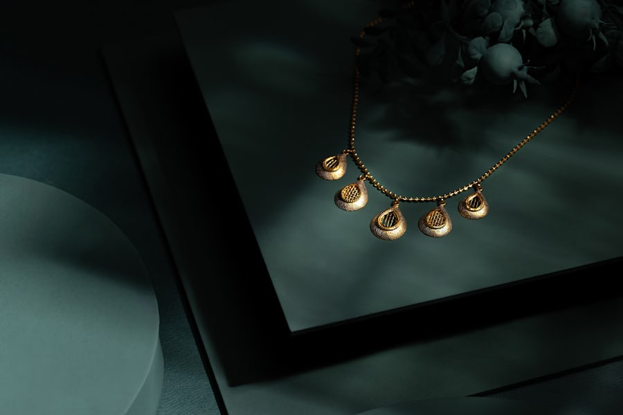
Restraint is the defining characteristic of successful luxury ecommerce design. Where mass-market stores use dense grids, promotional banners, and high-velocity visual cadence to communicate value and urgency, luxury stores use space, silence, and precision. A product image that fills the viewport communicates importance. White space around a product says it deserves contemplation. Typography that does not shout says the product speaks for itself. Every element that does not add to the experience of quality subtracts from it.
Color palettes in jewelry ecommerce should be drawn from the products themselves, not imposed over them. Neutral backgrounds — warm whites, cool greys, soft blacks — allow gold, silver, and gemstone tones to read accurately. Colored backgrounds, even tasteful ones, introduce a color cast that changes how metals and stones appear and creates doubt in the customer's mind about the actual product color. That doubt costs conversions and increases returns.
Typography hierarchy in luxury jewelry ecommerce communicates brand positioning before a customer reads a word. Serif typefaces with optical tracking, set at generous sizes with ample leading, signal heritage and craftsmanship. The choice of type is as much a brand decision as the choice of packaging — and in a digital-only store, it is the packaging.
“In jewelry ecommerce, every pixel that does not communicate quality communicates the opposite. There is no neutral ground between luxury and commodity.”
Product Presentation That Commands Premium Prices
Multiple photography angles are not optional in jewelry ecommerce — they are the primary conversion driver. A ring photographed from a single overhead angle loses sales to a ring shown from above, from the side, on a hand, and in detail close-up. Customers buying jewelry online need to understand the piece dimensionally — how it sits, how it catches light, how it looks in motion. Each additional high-quality angle reduces uncertainty and increases the probability of purchase.
Lifestyle photography — the piece in context, on a person, in a real environment — serves a different purpose from studio photography: it communicates aspiration and scale simultaneously. A necklace photographed against the collarbone gives customers an accurate sense of proportion. The same necklace photographed on a velvet display stand conveys craft but not scale. The best jewelry product pages include both — and the lifestyle image should be the first one the customer sees.
Material specification should be presented with the same care as the visual. Customers buying at premium price points want to know exactly what they are buying: the karat weight of gold, the metal alloy for silver, the carat and cut grade for stones, the clasp mechanism for bracelets and necklaces. This information is not supplementary — it is load-bearing for the purchase decision. Stores that present it clearly, formatted for scanning rather than reading, convert at measurably higher rates.
Rubio: A Jewelry Ecommerce Template Built for Premium Conversion
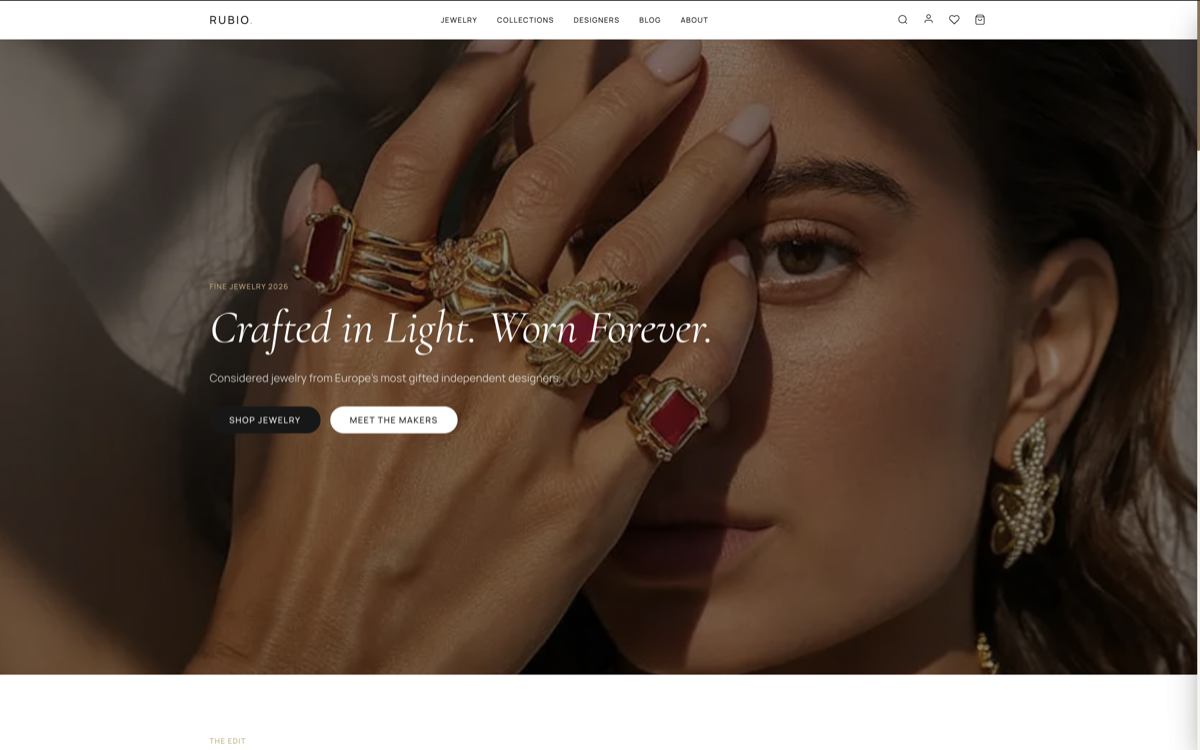
Rubio is a Next.js ecommerce template designed for jewellery makers, watch brands, and premium accessory sellers. The visual architecture prioritises product imagery above all — full-viewport hero images on the product page, a gallery layout that sequences photography from lifestyle to detail to studio, and typography that signals luxury positioning before a customer reads the product description.
Trust Signals and Conversion in High-Value Niches
At high price points, trust is the primary barrier to conversion. A customer willing to spend €500 online on a piece of jewelry needs to trust that the product will match the photography, that the seller will honour their return policy, that the payment is secure, and that the brand has genuine standing. Each of these trust dimensions requires explicit signals in the store design — not implied, not assumed.
Return and exchange policy visibility directly impacts jewelry conversion. A customer considering a €300 necklace who cannot easily find the return policy will not buy — the unknown risk outweighs the known desire. Stores that display return terms clearly on the product page (not buried in a footer link) consistently show higher conversion rates on high-ticket items. The policy does not need to be generous — it needs to be visible.
Customer reviews with photo submissions are the most powerful trust signal in jewelry ecommerce because they serve dual purposes: they validate product quality through social proof, and they provide additional photography perspectives that the seller's studio images may not cover. A review showing the necklace on a different skin tone or body type removes uncertainty for customers who cannot see themselves in the official photography. Every customer photo uploaded is a conversion asset.