Home Decor Ecommerce UX Best Practices: How Great Design Increases Sales
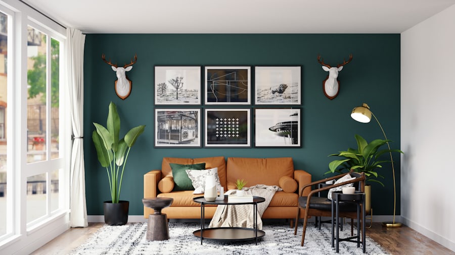
Home decor ecommerce has a problem that most categories do not: customers cannot easily evaluate fit before purchase. A shirt can be returned if the size is wrong. A book works on any shelf. A €350 lamp purchased online needs to work with a specific room, a specific light temperature, a specific wall color, and a specific aesthetic that the customer can describe but rarely photograph. The stores that solve this problem at the UX level — through intelligent filtering, contextual photography, and detailed specification — win the category. Those that present home decor like commodity retail lose to the stores that do.
Why UX Matters More in Home Decor Ecommerce Than in Most Categories
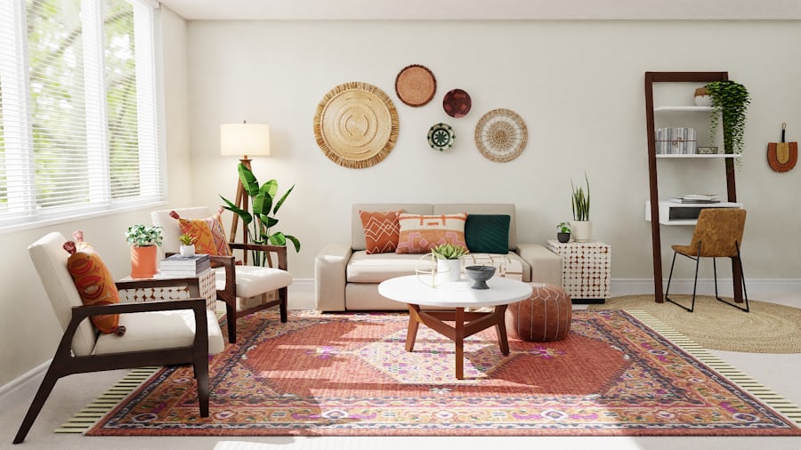
The purchase decision in home decor is fundamentally spatial. Customers are not just evaluating a product in isolation — they are evaluating it in the context of a room they already know, with dimensions they may or may not have measured, in combination with other furnishings whose colors and styles they are trying to coordinate. This context-dependency means that every piece of information that reduces spatial uncertainty — room context photography, explicit dimensions, color accuracy callouts, scale references — directly increases conversion probability.
Return rates in home decor are disproportionately driven by expectation mismatch. The color looked different on screen. It was larger than expected. The material felt different from the photographs. Each of these is a UX failure — a failure to communicate accurate information before the purchase decision. Stores that invest in photography that includes scale references, color accuracy disclaimers, and material detail shots see return rates 30–50% lower than stores that use standard product photography. Fewer returns means lower operational costs and higher net margin — the UX investment pays for itself.
Average order value in home decor ecommerce is typically higher than in fashion or beauty — customers buy fewer items but spend more per item, and they frequently buy coordinating pieces in a single session. The stores that facilitate coordinated buying — “complete the look,” room-based collections, style family groupings — see session values that justify every investment in the browsing and discovery experience.
“Home decor UX is fundamentally about spatial confidence. Every design decision should reduce the gap between what the customer imagines and what they receive.”
Product Discovery and Filtering in Home Goods Stores
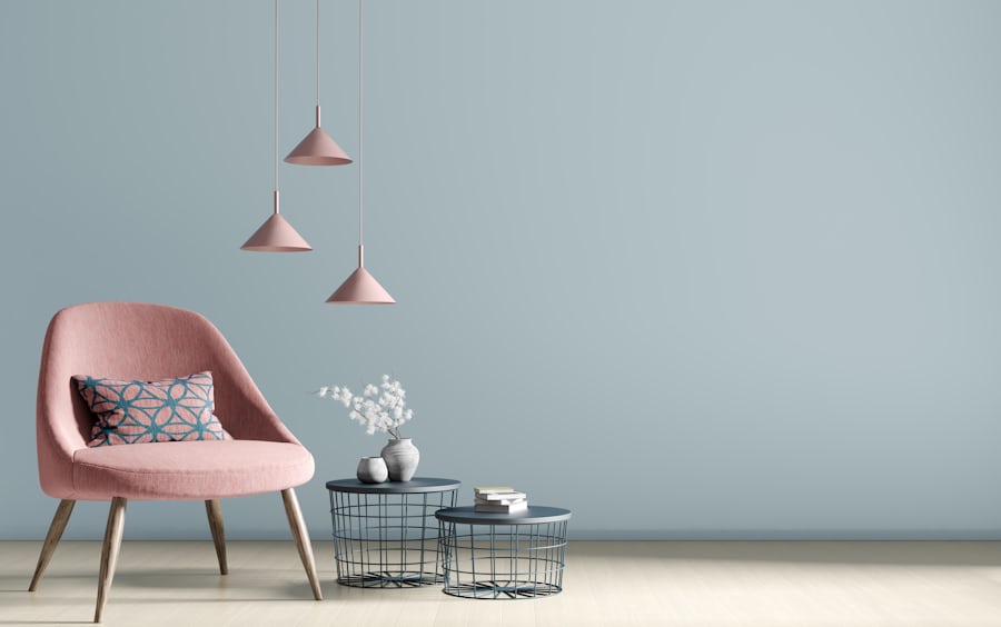
Style-based filtering is the most effective discovery mechanism for home decor — more effective than category or price-based navigation for customers who arrive with a clear aesthetic vision but no specific product in mind. Filters like “Scandinavian,” “Industrial,” “Japandi,” or “Coastal” allow customers to filter by the aesthetic language of their room rather than by product type, returning a coherent selection that feels like a curated collection rather than a search result.
Room-based navigation — where customers can browse by room rather than product category — significantly reduces the cognitive load of coordinated buying. A customer furnishing a living room wants to see what works in a living room, not browse “sofas,” “cushions,” and “rugs” separately and mentally coordinate the results. Stores that organise at least part of their navigation by room context see longer session durations and higher multi-item cart rates.
Color filtering with visual swatches — not text labels — converts better in home decor than in almost any other category. A customer looking for a warm grey cushion will filter by color before they filter by size or material. Accurate color swatches that match the product photography allow customers to filter with confidence rather than hope. The technical investment in accurate color rendering across devices is one of the highest-return optimisations available to home decor stores.
Velora: A Home & Living Ecommerce Template That Converts
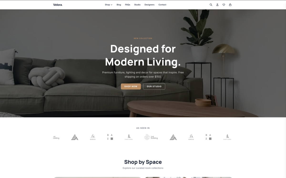
Velora is a Next.js ecommerce template designed for home goods, interior accessories, and lifestyle product sellers. The product page architecture prioritises contextual photography — room-in-context images are the primary visual, with isolated studio shots as secondary references. The filtering system supports style-based, room-based, and attribute-based filtering simultaneously, returning results instantly via client-side filtering without page reloads.
Mobile Experience and Checkout Optimisation for Home Decor
Mobile purchase rates in home decor lag behind desktop more than in most categories — not because mobile customers are less willing to buy, but because most home decor stores fail to translate the product browsing experience to mobile. Large product images that require pinch-zoom to view detail, filtering systems that collapse to usability on small screens, and checkout flows that require extensive form filling on a touchscreen all contribute to mobile cart abandonment rates 20–30% higher than desktop.
Mobile-first architecture — where the mobile experience is designed first and the desktop experience adapts from it, rather than the reverse — produces measurably better mobile conversion in home decor. Touch targets sized for thumbs rather than cursor precision. Image galleries that swipe natively. Filters that open as a full-screen overlay rather than a sidebar. Checkout that auto-fills addresses and offers Apple Pay and Google Pay as primary payment options. Each of these is a mobile-specific design decision that pays conversion dividends.
Wishlist functionality reduces mobile purchase hesitation meaningfully in home decor. A customer browsing on mobile during a commute who finds a piece they want can save it to their wishlist and complete the purchase later on desktop — where they can view the room context photography at full size and confirm dimensions on a larger screen. Stores that offer persistent wishlists that sync across devices capture these deferred conversions that otherwise turn into lost sessions.